2020
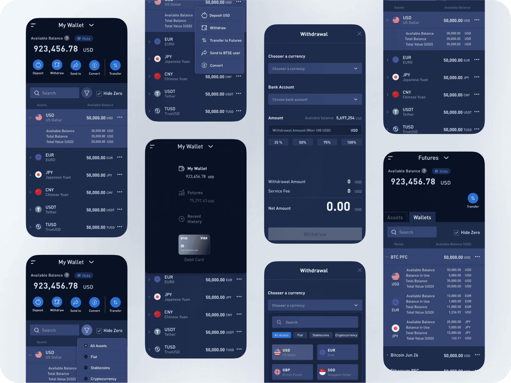
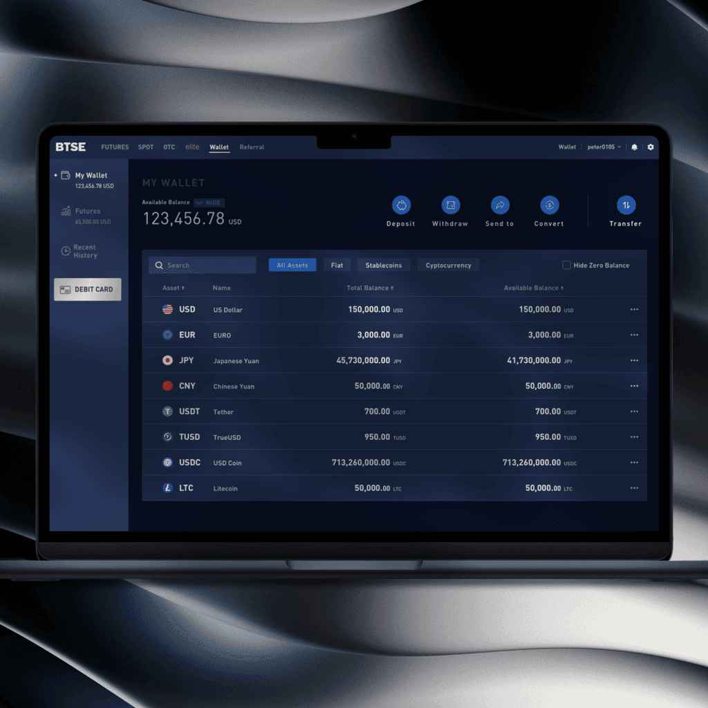
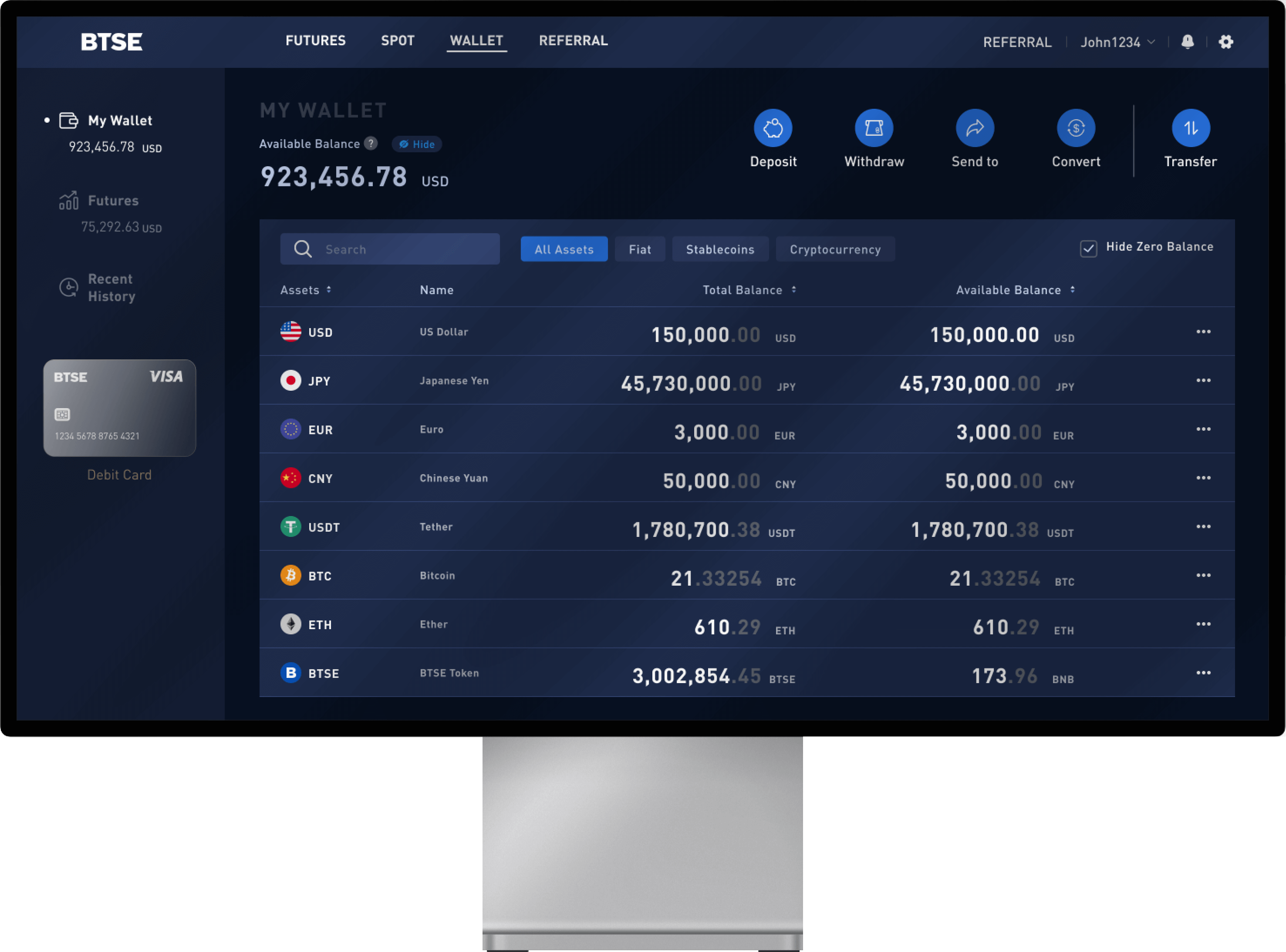
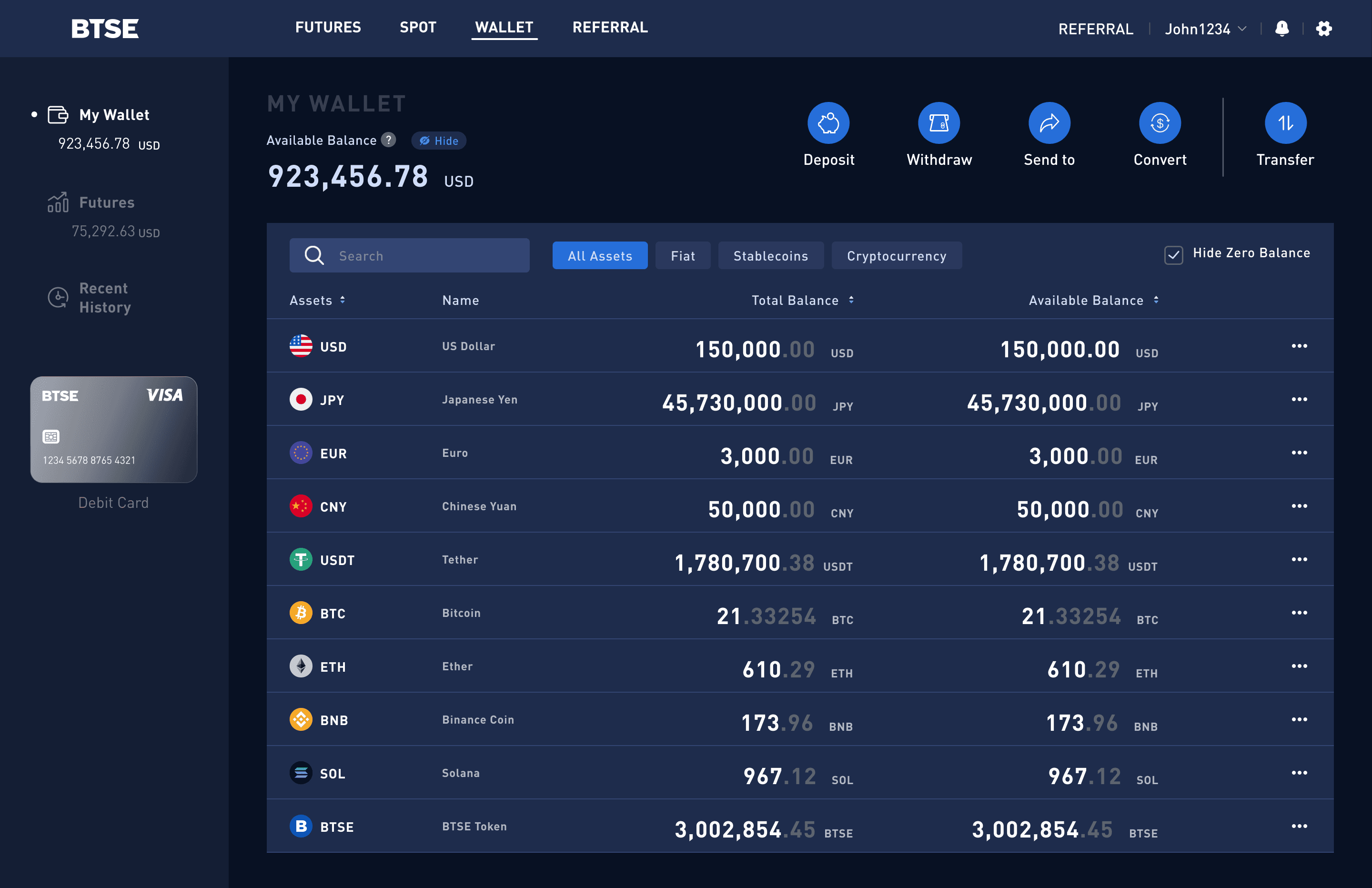
Redesigned wallet overview UI to show total balance and asset categories more clearly, improving information clarity and visibility.
Repositioned key CTAs (Buy, Send, Deposit, Withdraw), cutting average task time by 13 seconds through faster access.
Created modular UI flow docs, reducing handoff time and minimizing the need for clarification.
Unified updates under BTSE’s design system to ensure consistency and reduce redundant work.
Proactively aligned with engineers and QA to cover edge cases, improving cross-functional accuracy.
Cut wallet-related support tickets by 17% in the first 2 months, based on internal client data.

Services
UX & UI Design
Platforms
Website
Web App
Tools
Sketch
Illustrator
My Role
UX/UI Designer
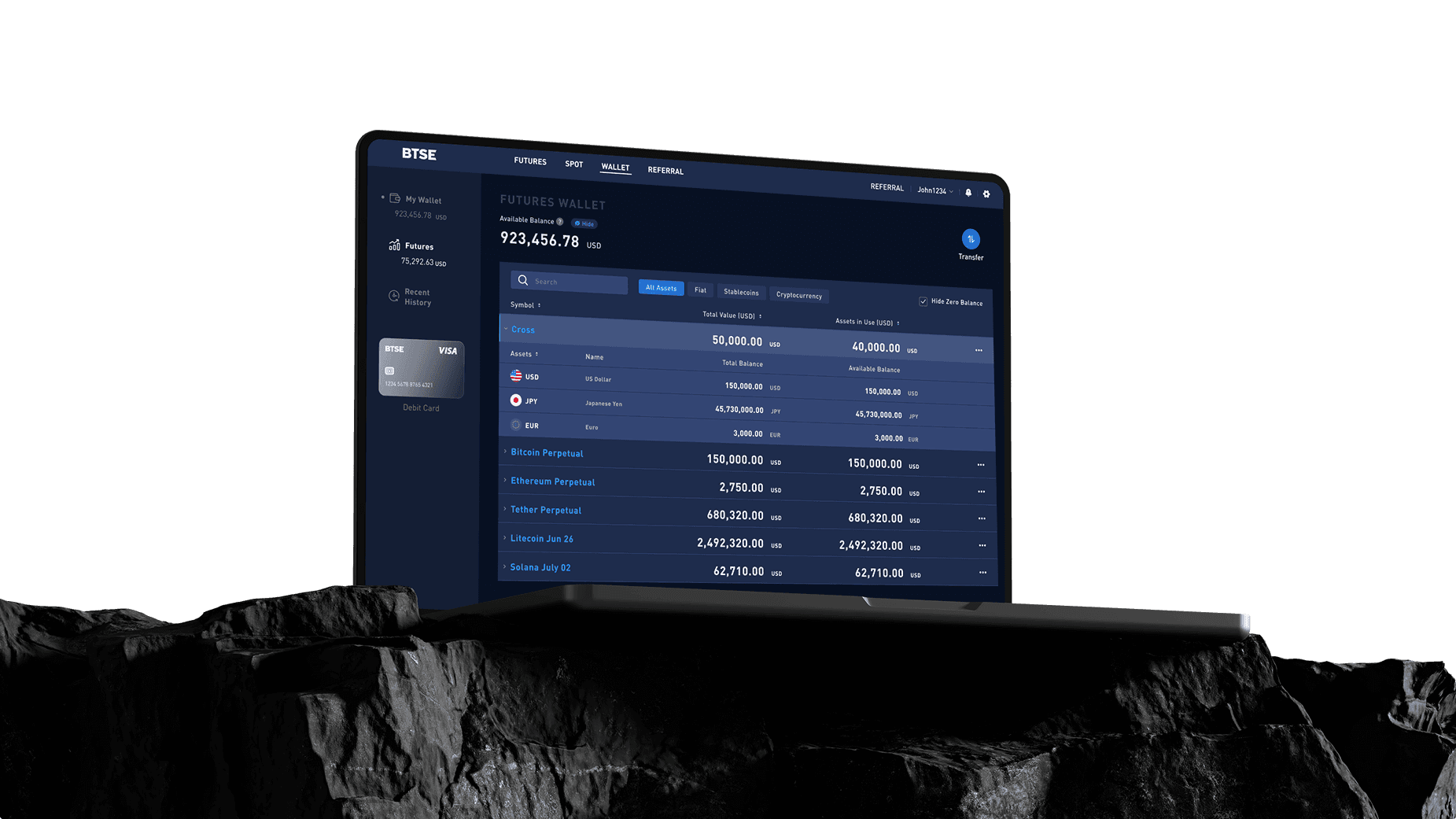
BTSE is a professional crypto exchange for experienced traders. This project focused on refining its mature wallet feature within an established agile workflow. My role involved optimizing the UI/UX and consolidating fragmented updates into a cohesive redesign to ensure a consistent experience for power users. I was responsible for the full wallet experience, from Spot Balance to key actions like Deposit and Withdraw. By refining layouts and simplifying flows, I improved usability and task clarity, repositioning key CTAs to cut the average task time by 13 seconds.
Duration: Agile development, with task scopes typically ranging from 2 days to 2 weeks
TA:
Pro-level crypto exchange users
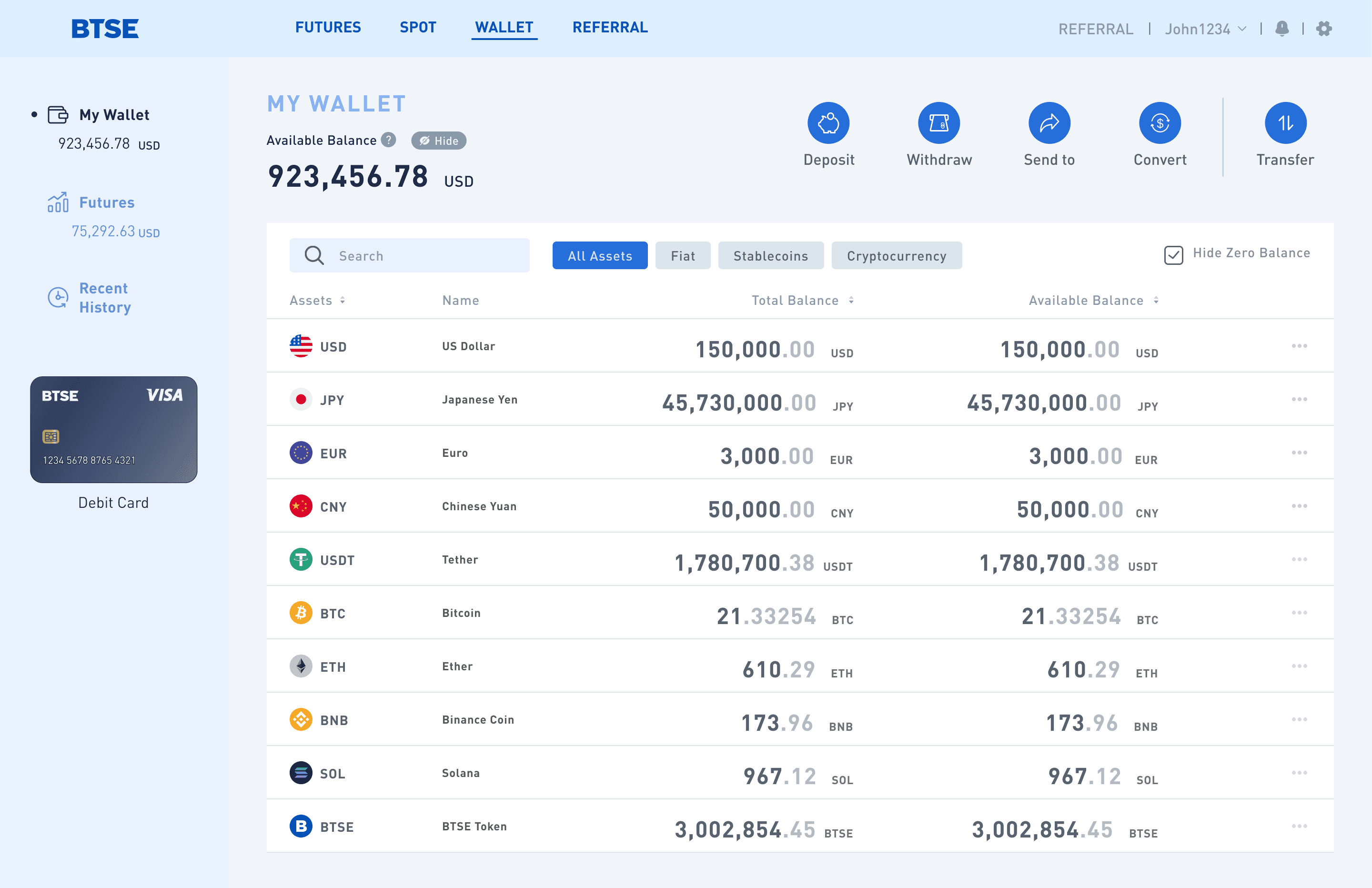
Scope: Designed the wallet agesIntuitive crypto portfolio management, redesigning total balances, asset distribution, and common actions (Buy, Deposit, Withdraw, Transfer, Exchange) for efficiency.
While the wallet feature is powerful and built for pro-level needs, years of feature stacking during development led to a cluttered, unclear interface. Based on internal analytics and PM feedback, we identified the following user pain points:
Hard to Grasp Overview
46% of users couldn’t easily view their total balance on a single screen. The unclear information structure made scanning difficult.
Inefficient Task Navigation
Simple actions like making a deposit required an average of 5 clicks, with users navigating across multiple screens.
Slows Down Power Users
Professional traders reported that the excessive steps interrupted high-frequency workflows, risking lost time and missed trades.
Confusing for Newcomers
38% of new users dropped off before completing their first transaction—mainly due to the overly complex interface.
Partnering with a data-driven PM, I gained sharp insight into how users interact with crypto wallets and where they struggle most. This shaped our core design goal: reduce friction while preserving functionality, making key asset info clearer and daily actions faster for both experts and newcomers.
Enhance Asset Presentation
Make total value and asset allocation instantly visible through a more intuitive data layout.
Prioritize Quick Access to Features
Surface high-frequency wallet actions—like deposit, transfer, withdrawal, send, and convert—for faster task completion.
Reduce Cognitive Load
Organize content with a clear UI hierarchy and modular structure to simplify navigation.
Optimize for Speed
Streamline workflows for power users while keeping the experience approachable for newcomers.
Working in a mature, agile team meant navigating a highly specialized workflow, and tasks were split into small units across departments. This boosted efficiency but also created key design challenges.
Designers owned isolated features with little visibility into the full user journey, making it hard to maintain consistency. New features often felt like add-ons, lacking cohesive design logic or integration.
To improve how users understand their assets at a glance, I restructured the wallet layout based on natural visual flow. By thoughtfully applying typography, color, and contrast, I transformed dense asset data into a clear, readable visual hierarchy. This made it easier for users to instantly grasp their total balance and asset breakdown, while preserving privacy and allowing them to toggle between preferred currencies for better personal clarity.
I streamlined core wallet actions like deposit and withdrawal into faster, more intuitive flows. With minimal steps and clear, timely feedback, users could complete tasks confidently and accurately. This reduced friction and helped lower task abandonment by balancing simplicity with essential information.
To reduce eye strain for heavy crypto users, I designed both Light and Dark Modes with adaptive background colors and consistent UI elements. This dual-theme system enhanced visual comfort across extended sessions while maintaining brand consistency and simplifying developer handoff. Post-launch feedback confirmed higher satisfaction and longer usage time, especially among advanced users.

To support professional users managing both assets and active trades, I integrated real-time contract trading information directly into the wallet view. This allowed users to monitor ongoing positions alongside their portfolio—without needing to switch contexts. By surfacing key contract details in a consolidated view, we improved task efficiency and supported faster, more informed decision-making for high-frequency traders.
With 66% of users on mobile, I redesigned the wallet interface specifically for smaller screens, beyond just adapting the desktop UI. By simplifying layouts and tailoring interactions, we improved task completion and reduced bounce rates, delivering a seamless experience across mobile web and app.