2020
Collaborated with a co-designer to synthesize research and align structure, flow, and priorities in just 7 days.
Hosted planning sessions with developers to translate design insights into feasible features and timelines.
Ensured a consistent experience and design language across two designers for a seamless product.
Delivered all key flows and visuals within 45 days, launching on time with full scope.
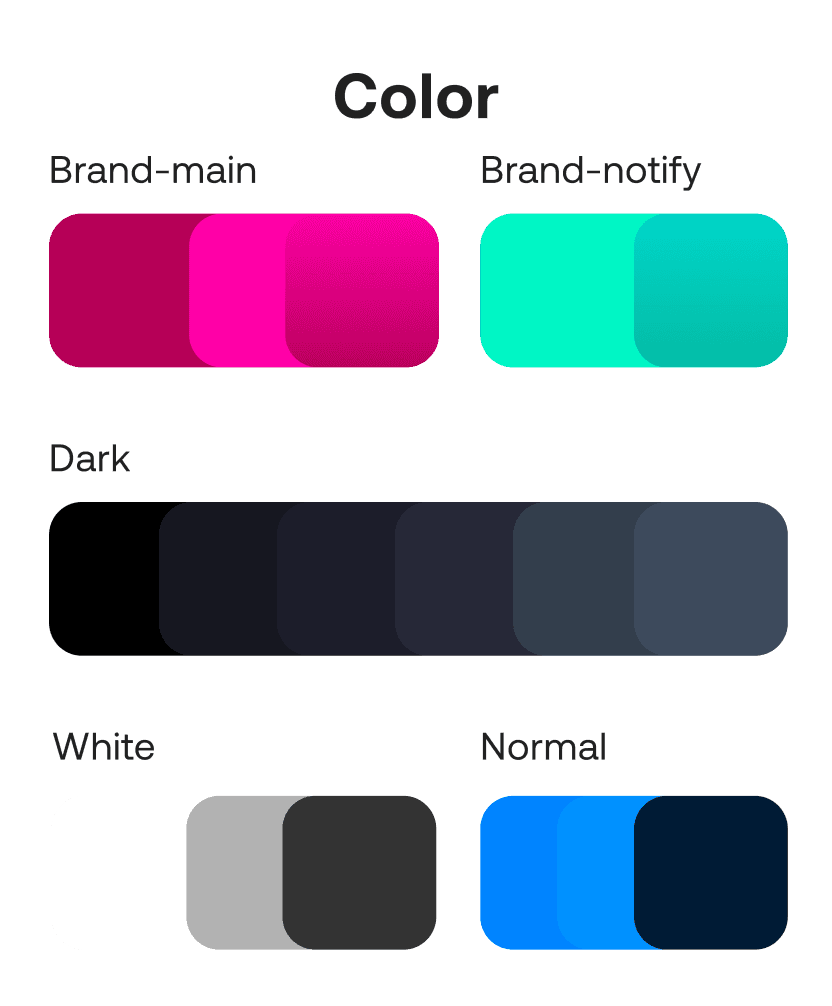
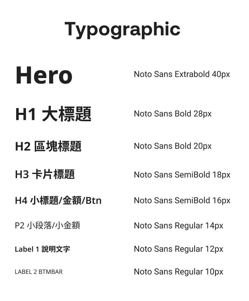
Built a flexible design system to let the client scale and maintain the UI independently.
Secured full stakeholder buy-in through clear rationale, specs, and cross-team syncs.
Services
Research
UX & UI Design
Platforms
Website
Tools
Figma
Illustrator
My Role
Researcher
UX/UI Designer
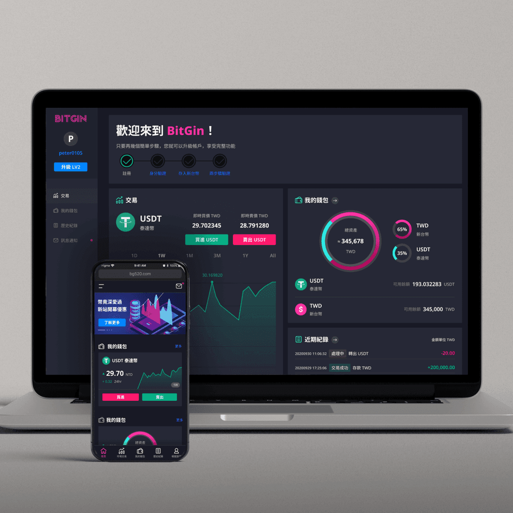
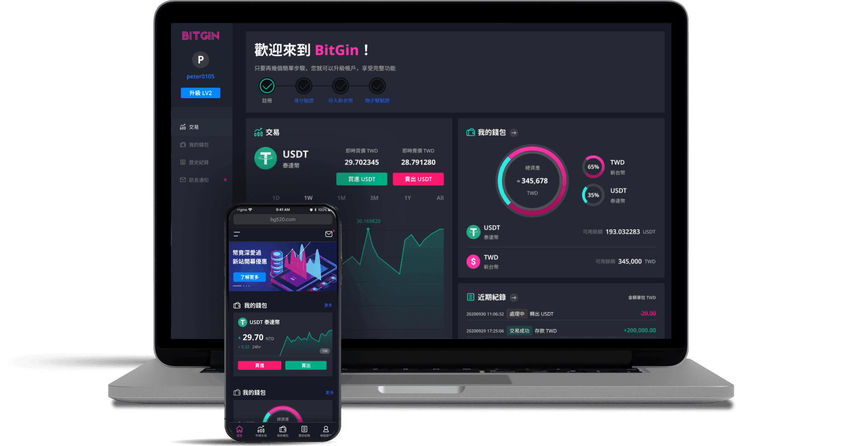
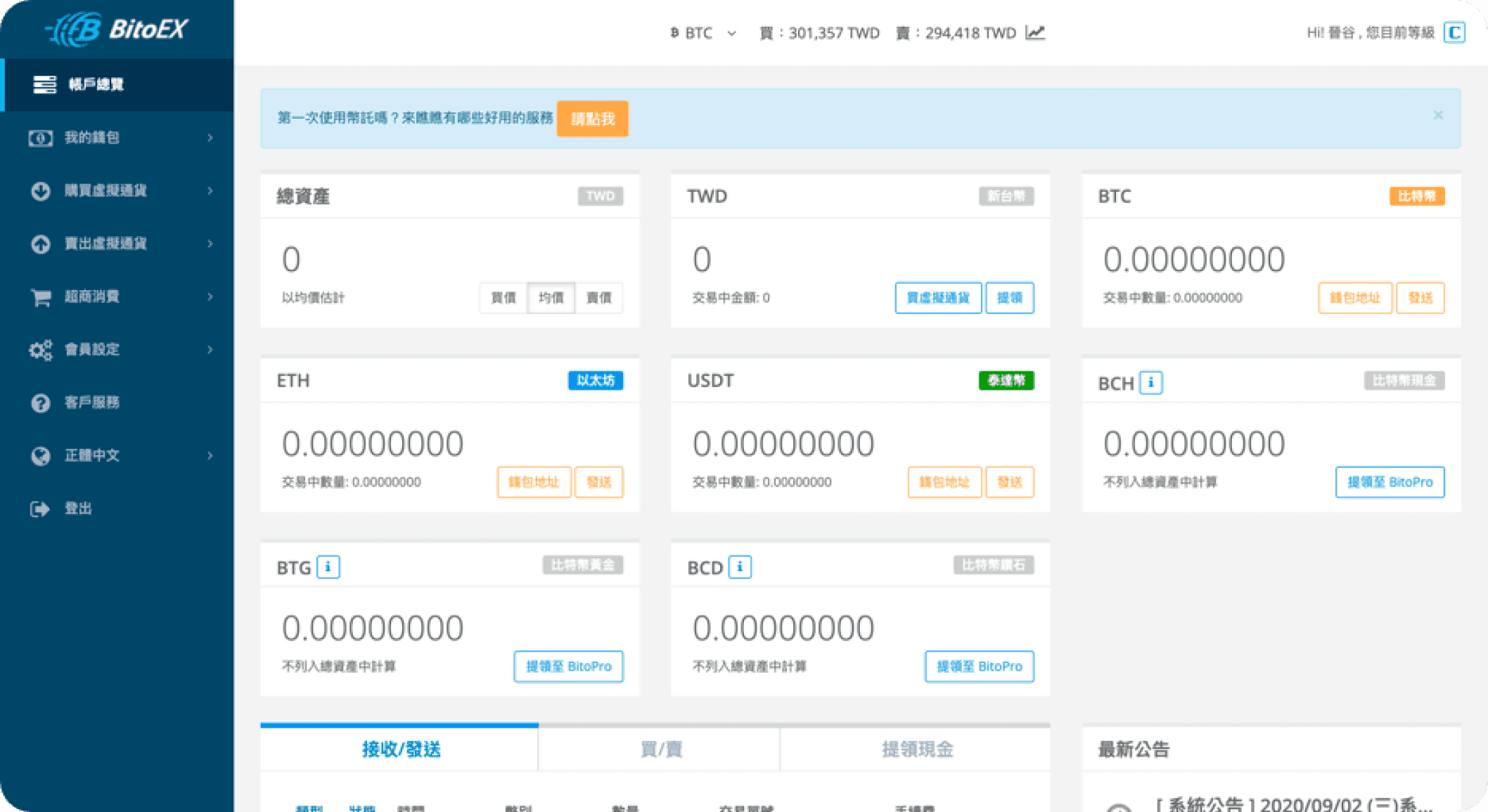
Web3's rapid growth left many newcomers behind on confusing crypto platforms. BitGin was designed to solve this by offering a simple way for beginners to enter the market. I teamed up with another designer to simplify the onboarding process, add guided steps, and create a user-friendly interface. Our collaboration on feature planning and user flows was completed in just seven days. My focus was on multi-level KYC verification and core crypto trading features to help beginners take their first step with confidence.
Client: BitGin Company
Duration: 45 Days
TA:
Entry-Level Web3 Users
Scope: Led UX for a crypto platform focused on onboarding, conversion flow, and mobile usability for first-time users.
To build a beginner-friendly crypto exchange, we first stepped into the users’ shoes. Through interviews and competitor analysis, we asked, why do so many want to start using crypto but never take the leap? Our goal was to uncover the key pain points and barriers blocking their first step into Web3.
Similar Products
High Entry Barriers
Most beginners don’t know where to start, and the lack of clear guidance makes onboarding overwhelming.
Complex Interfaces
Advanced features and dense data make it hard for new users to find key actions.
Fear of Mistakes
Users worry about errors that could lead to financial loss, creating hesitation and distrust.
Tedious Verification
Long KYC steps and personal data requirements often lead to frustration and drop-off.
Our research revealed a clear result: crypto beginners don’t need more features—they need fewer barriers. Most platforms overwhelm users, making it hard to know where to start. We redesigned the experience with intuitive onboarding, simplified core actions, and clear step-by-step guidance to help users feel confident from the very first click.
Simplified Functionality
Prioritize only the core tasks users need to get started.
Clear, Visual Interface
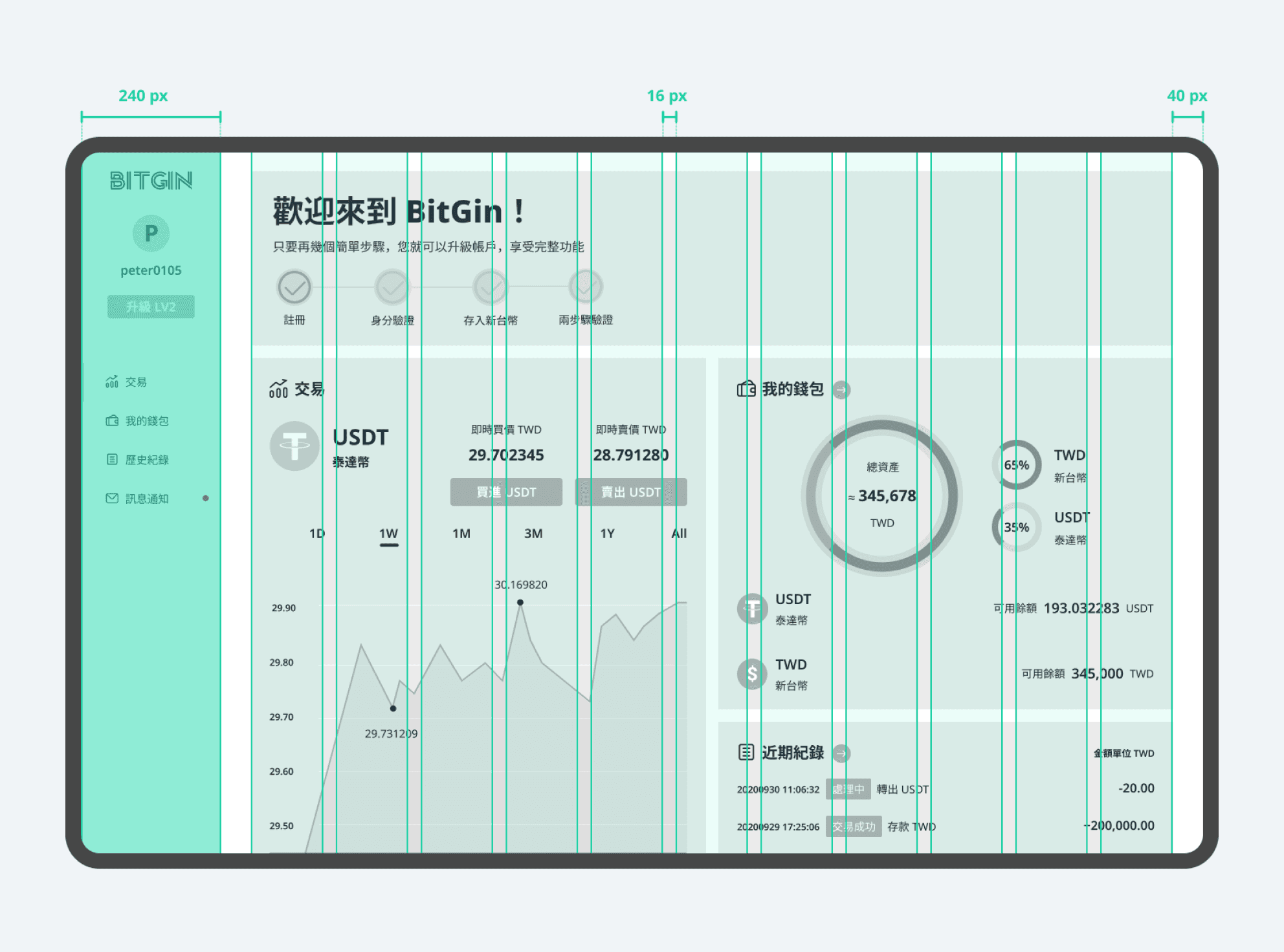
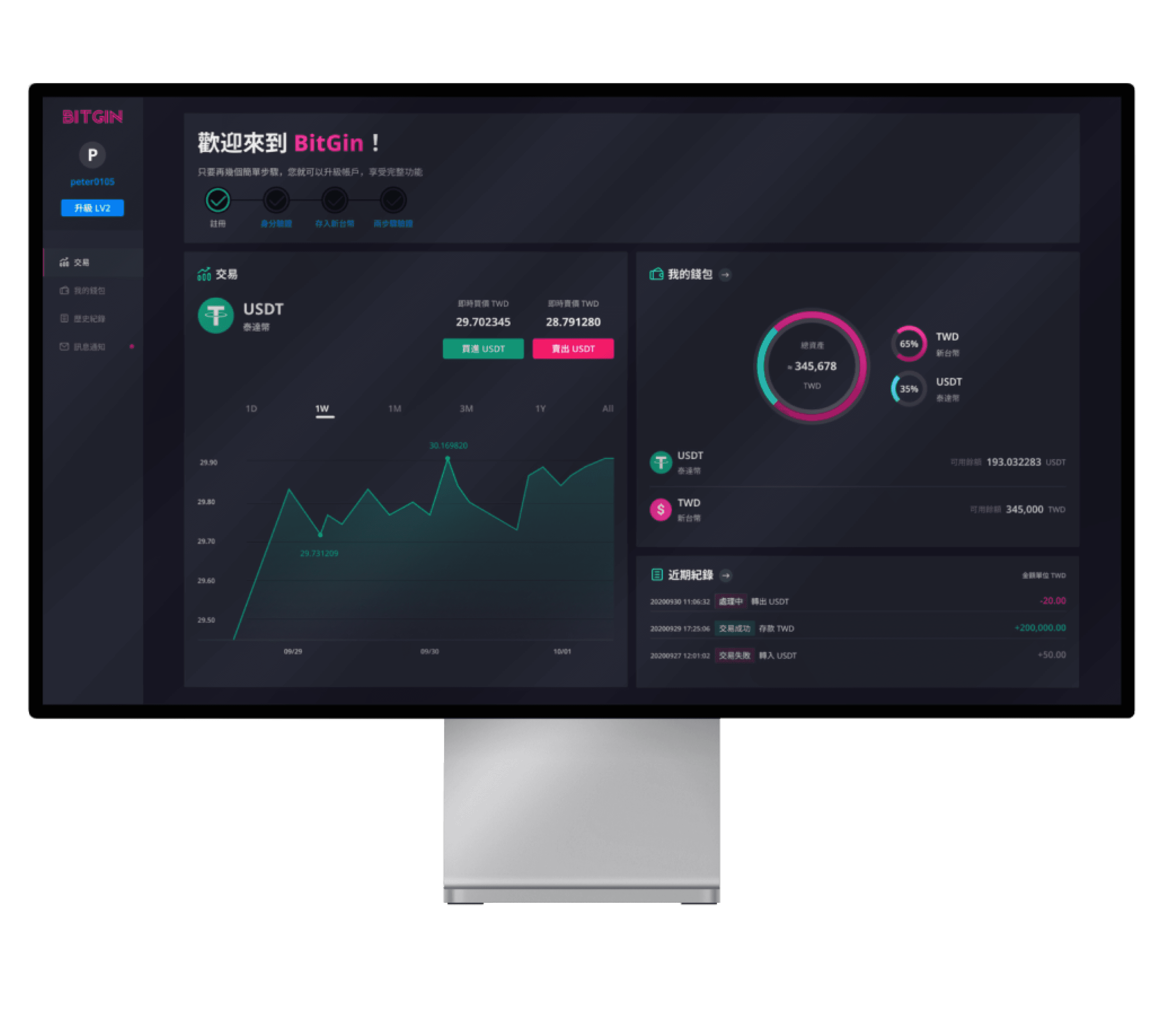
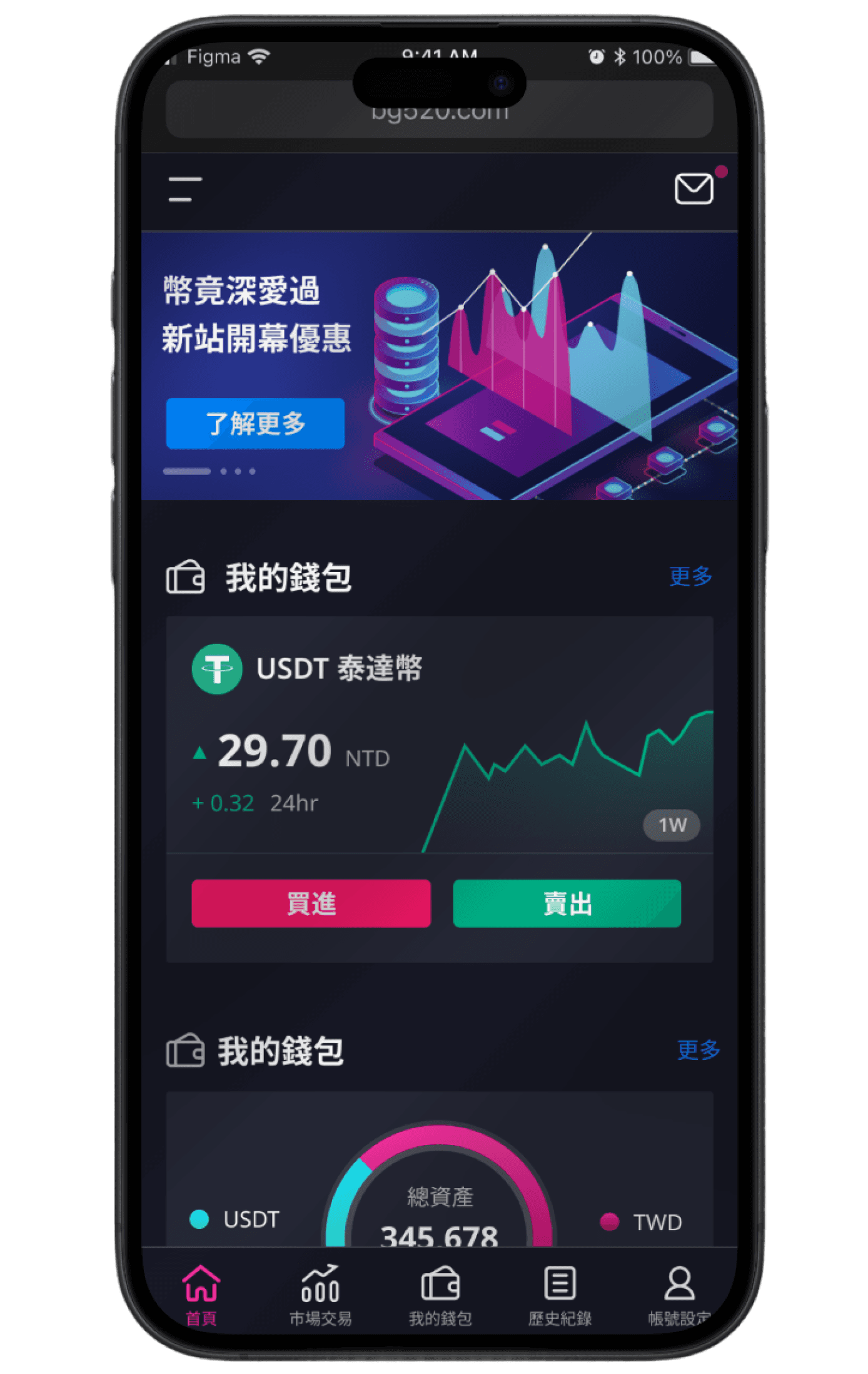
Design a dashboard-style layout with flat, easy-to-navigate information.
Step-by-Step Guidance
Use tooltips, progressive hints, and microinteractions to reduce user error.
Phased Task Flows
Break down complex actions like registration and trading into smaller, digestible steps.
As a two-designer team, we aligned early through joint research and planning, co-defining the product structure based on user interviews and insights. We also worked closely with developers, sharing findings and ensuring alignment on scope, feasibility, and timeline throughout.
Despite splitting tasks, we ensured a unified design language across the product. In just 45 days, we delivered a polished, launch-ready interface and a scalable design system for future growth.
At this stage, two main designers collaborated on early research, defined the information architecture, and quickly mapped key user flows to align stakeholders and clarify the scope. We co-created a unified design system to ensure consistency and reduce rework. In just 45 days, we delivered a developer-ready product and reduced future design and development time by two weeks through the use of reusable components and a clear structure.
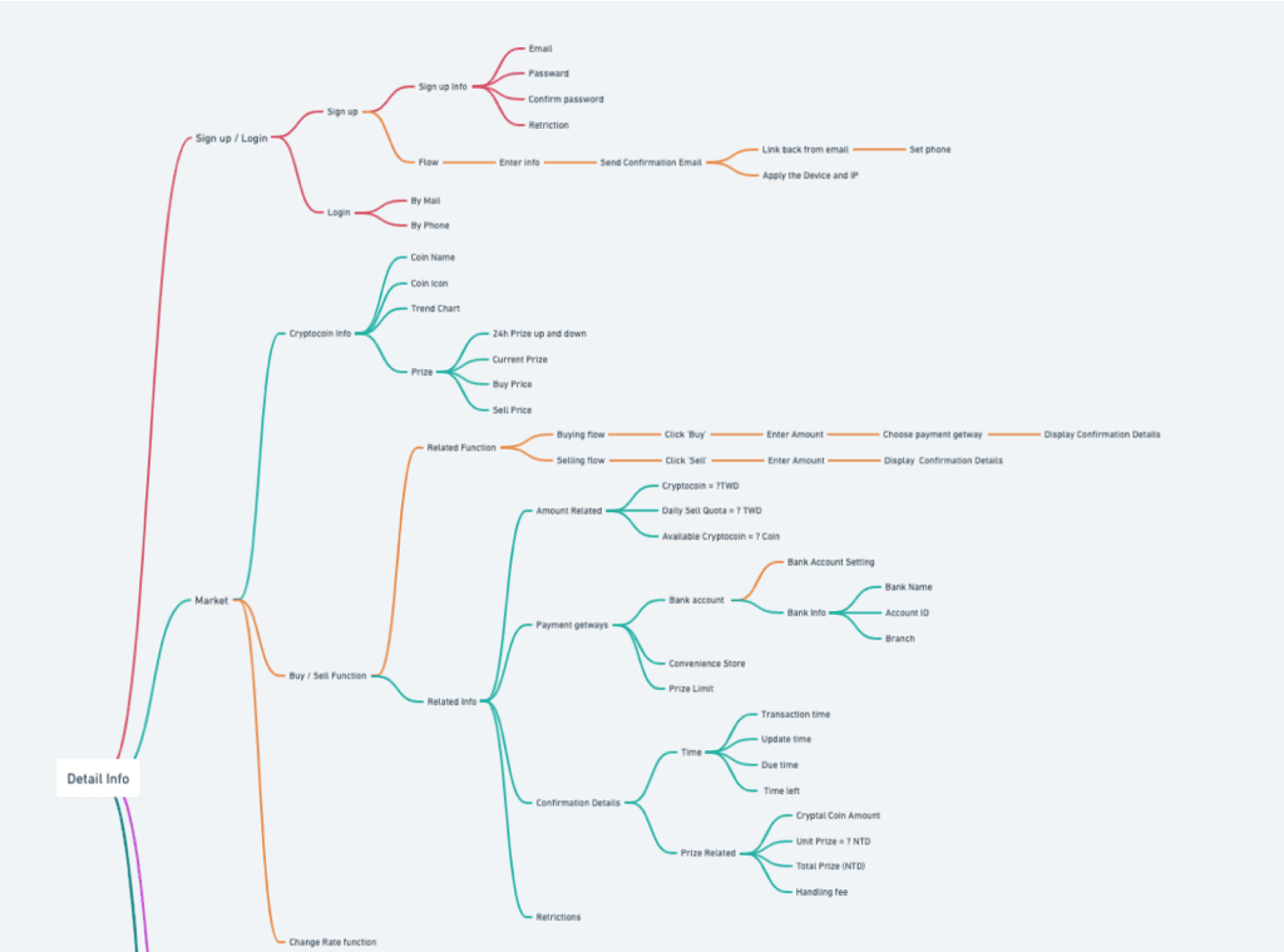
Information Architecture
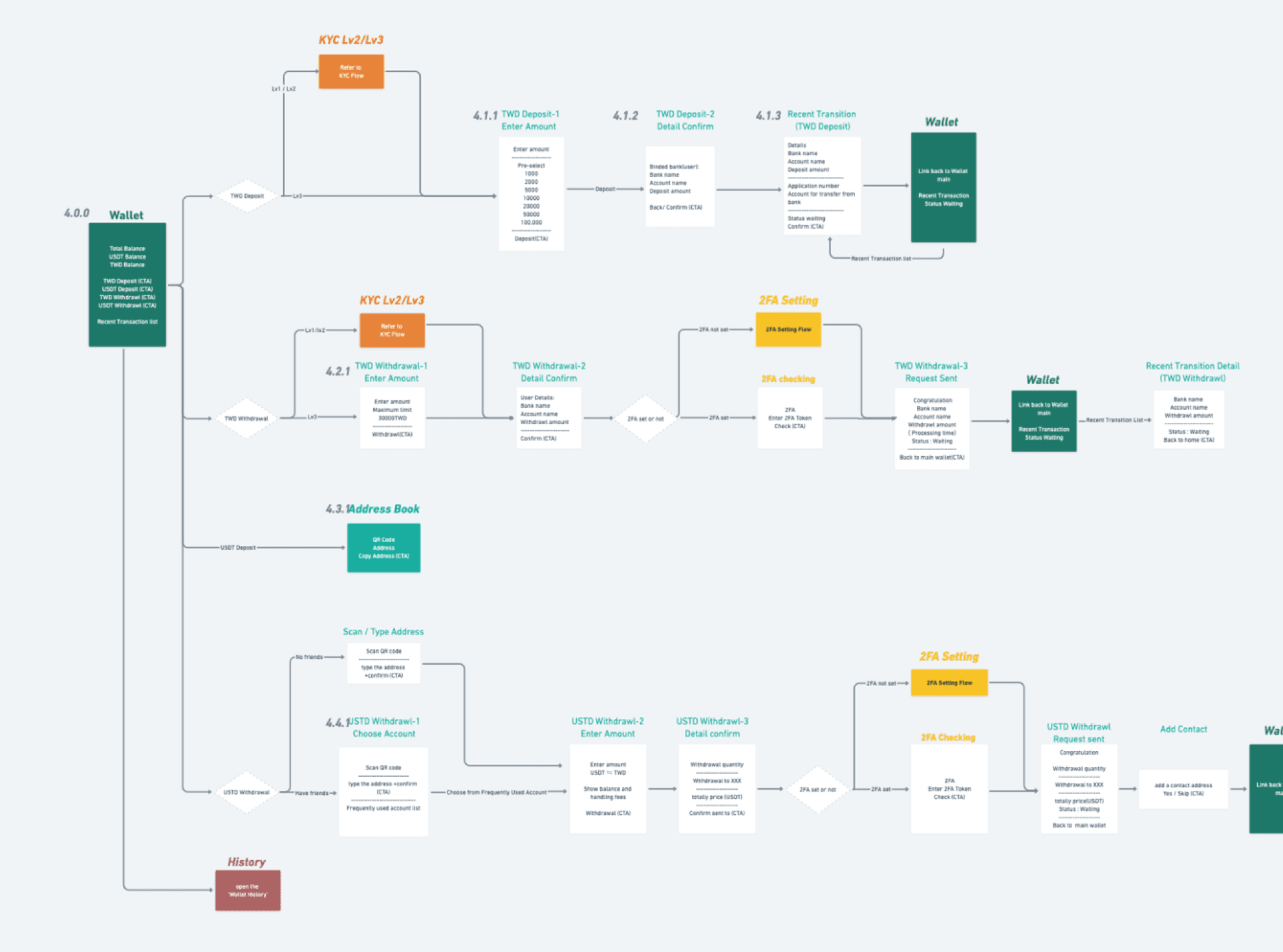
Flowchart
Wireframe
Grid System
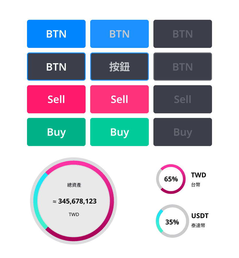
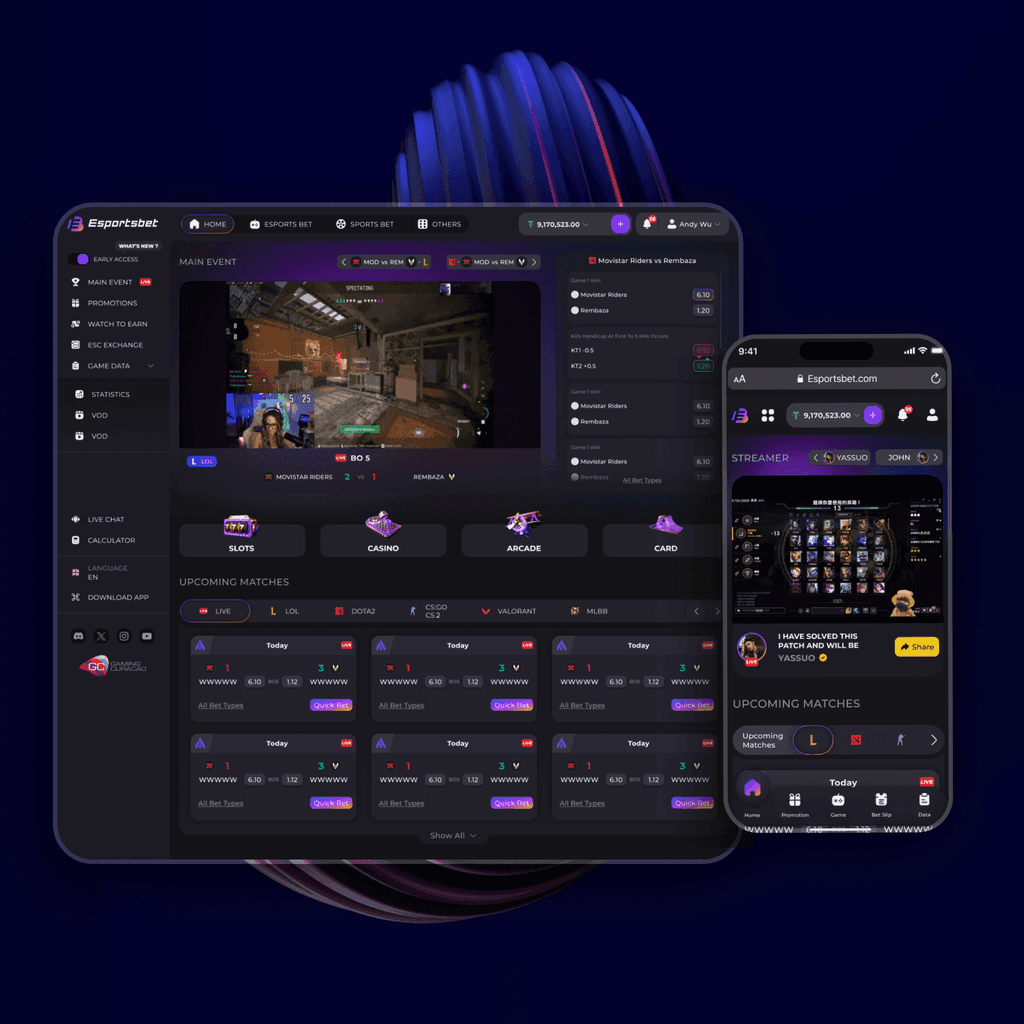
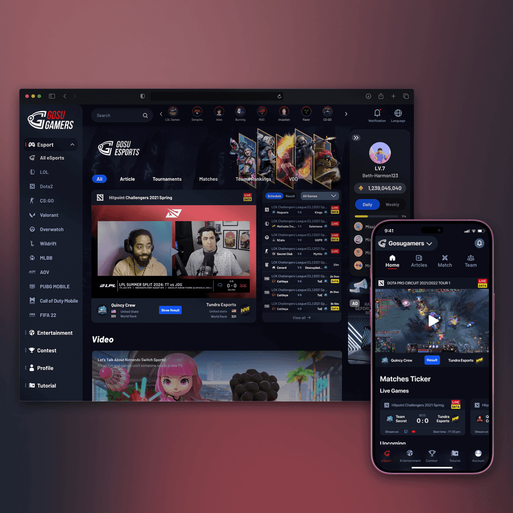
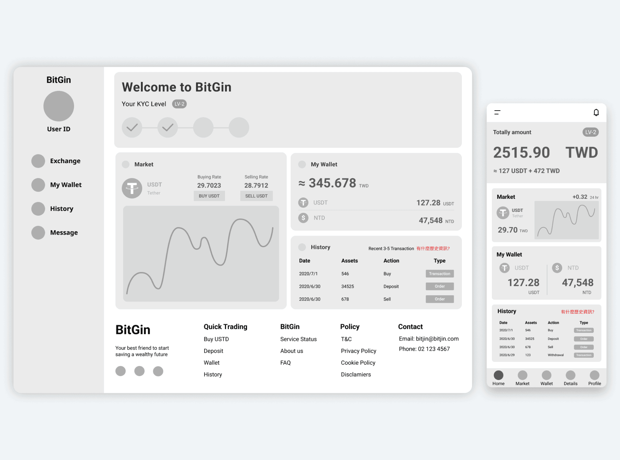
To make BitGin more beginner-friendly, we reimagined its UI with a warmer, human-centered design, while staying true to its brand. Brighter colors, friendly visuals, and conversational copy transformed the platform from intimidating to approachable, helping users feel more confident and welcome.
We also built a scalable design system from the ground up, aligning design and dev with clear components and layout rules. This cut iteration time by 40% and enabled a smooth 45-day MVP launch, setting the stage for long-term consistency and faster future development.


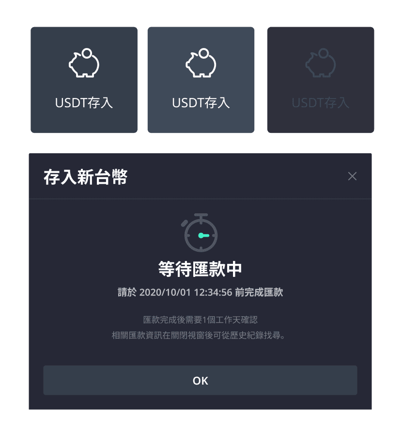
To reduce friction for crypto beginners, I utilized modal windows for key flows, such as Buy/Sell, Deposit/Withdraw, and Login/Signup, keeping users in context and minimizing anxiety during sensitive tasks. Follow-up client data showed a 22% drop in task abandonment, with users calling the experience “less overwhelming” and “easier to follow.” This simple design shift gave new users greater confidence and control.
To ease anxiety for crypto beginners during tasks like trading or withdrawals, I designed flows with bold visual hierarchy and clear, human-centered cues. Large step indicators and concise supporting info help users stay oriented, while bright CTAs and friendly icons reduce hesitation. I also mapped each screen into a UI flow, bridging the gap between design and development for faster, smoother implementation.
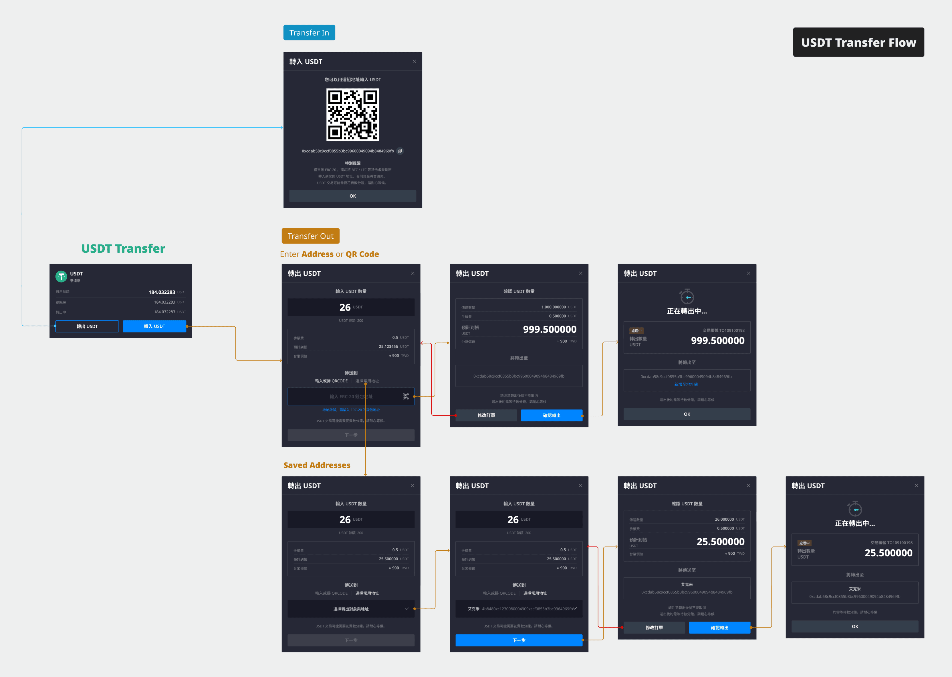
Transfer Flow